When selecting a centrifugal industrial pump multiple tools can be utilized, but the primary selection tool is the pump curve; also, commonly referred to as a selection curve, efficiency curve or a performance curve. Accurately reading a pump’s performance curve can ensure that your selection leads to a maximized service life with maximum efficiency during operation.
Pump Curve Basics
The most fundamental information displayed on a pump’s selection curve is its potential to create flow at various heads. As an example, below is a breakdown of the selection curve for our GemmeCotti HTT 9000 polypropylene 5 horsepower motor package.
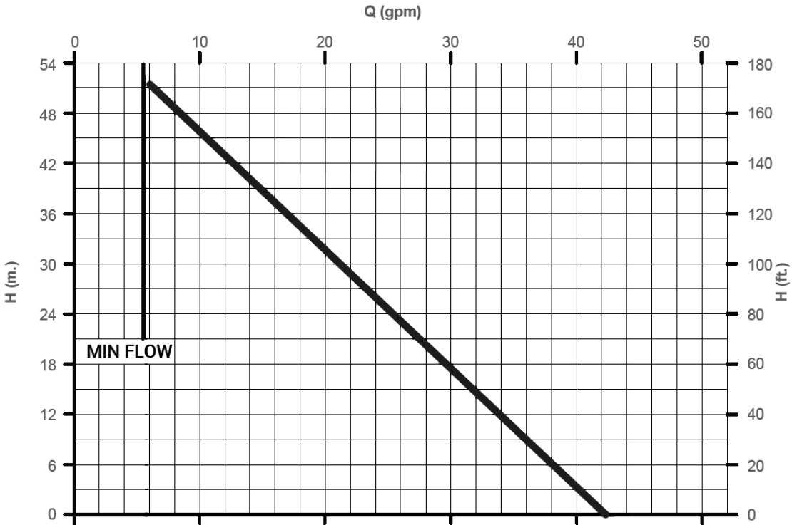
Head produced is always plotted on the vertical axis; in this case scenario, both feet (used in America) and meters (used by the remainder of the world) are listed on the right and left sides respectively. On the horizontal axis flow produced is plotted; in this case scenario, only gallons per minute (used in America) is listed on the top, but some selection curves will alternatively use liters per minute or meters cubed per hour (both used in the remainder of the world). Plotted on the graph is a curve that represents the capabilities of the pump.
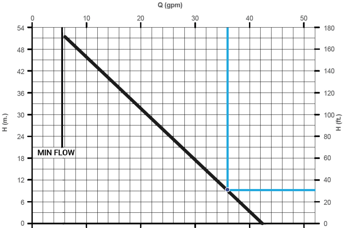
To determine flow that would be achieved at a given head, we can draw an imaginary vertical line down from anywhere on the top of the graph, or horizontal axis (Q / FLOW) until we reach the plotted curve. The number on our starting point on the horizontal axis is our flow. To determine the given head at that flow rate, we can draw an imaginary horizontal line from the point on the plotted curve to the end of the horizontal axis. The number at the end of that horizontal line is our head. Where the two lines meet is our operating point (blue lines and dot). For example, at 30 feet of head the HTT 9000 will produce an operational flow rate of 36 GPM.
Other considerations when reading more intricate pump curves Another example of a different performance curve is shown in our GemmeCotti HTM 100 Pump when ran on a 50 HZ, 2900 RPM motor; notice in this example the performance curve consists of four separate curves on the same graph; as well as, three separate but corresponding graphs.
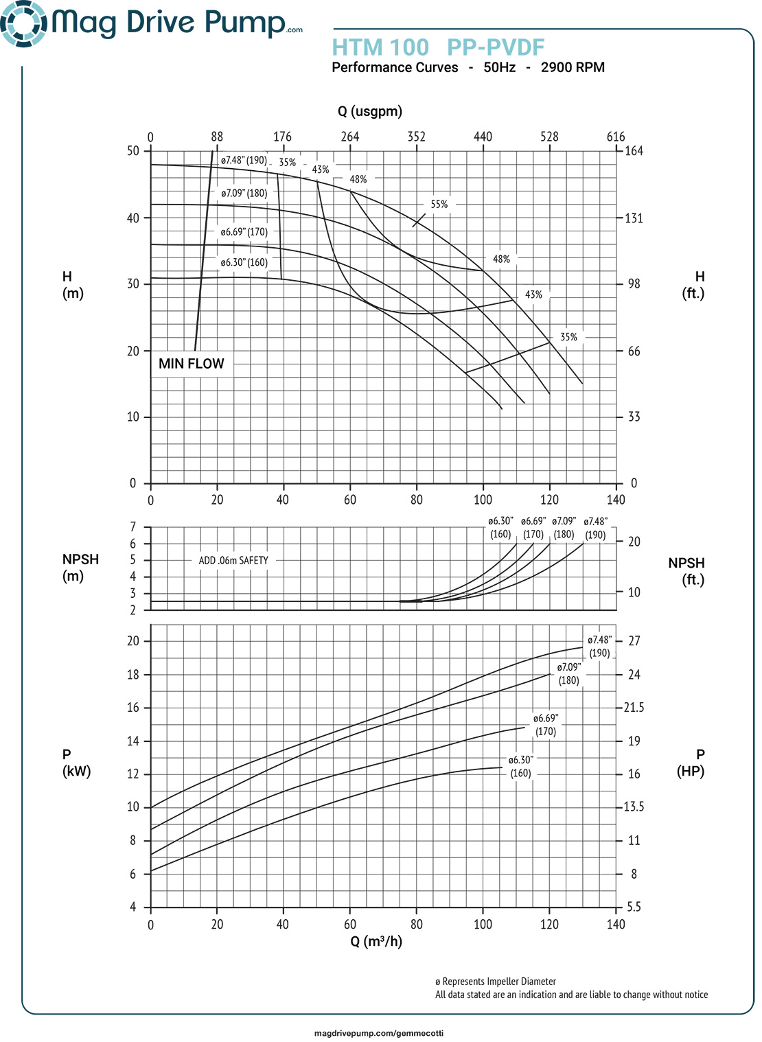
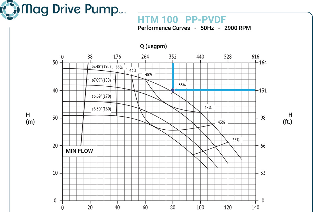
In principle the top most graph is the same as the previous example; however, you will notice this time there are four downward sloping curves plotted on it. Each downward sloping curve represents a separate impeller diameter. Manufacturers offer separate impeller trims to meet different flow-head combinations using the same pump; additionally, other popular magnetic drive pump brands chart their recommended impeller trims for higher specific gravities to avoid decoupling of the magnets; however, our Gemme Cotti pumps are manufactured with advanced magnet technology that avoids this decoupling problem. The upward sloping graphs represent pump efficiency: a ratio of a pump’s ability to transform mechanical energy into kinetic energy of the fluid, at a given flow; for example, at 352 gallons per minute and 124 feet of head, the pump is operating at 55% efficiency. This would use an impeller trim of 190mm, as this operating point falls closest to that impeller size.
The middle graph displays curves of the net positive suction head required (NPSHr). NPSHr is the minimum amount of head required on the suction side that will allow the pump to work properly. If the NPSHa (net pressure suction head available) is less than NPSHr cavitation will occur affecting both performance and longevity of the pump ultimately leading to failure of the pump. Translating this curve is similar to the first: we find our operating point, and we then make an imaginary line straight down until we reach the NPSH curve on the second graph. The point which we hit the curve will be our NPSHr. To find the numerical value of the NPShr, we draw a horizontal imaginary line to the end of the Y-axis, like we previously did for head. For example, if we desired 352 GPM with a 190-millimeter diameter impeller, we would require 2.5 meters of head on the suction side. In this example, you can read left for units in meters, or right for units in feet.

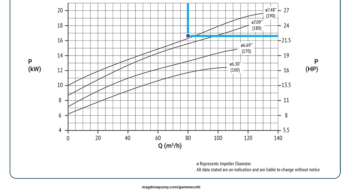
The lowest graph plots the energy requirement by the pump at a desired flow rate. The translation of this curve is similar to the first two: we start at our operating point, from there we make an imaginary line down, through the same NPSHr point discovered before, until we reach the curve of our desired impeller trim in the lowest graph. That point would be our required power. Again, if we made an imaginary line directly to the left or right, we can find our horsepower requirement (in units of kW or HP). For example, to pump 352 gallons per minute with a 190-millimeter impeller, the pump would require 22.3 horsepower.
Benefits of Pump Curve Literacy
As you can see, a pump curve communicates several key characteristics of a pump under specific operating conditions. By understanding how to read a performance curve an engineer can quickly determine speed in which a pump will move the liquid, the pressure difference the pump can overcome (head), and how much horsepower is required to operate at that condition. At Shanley Pump we understand that choosing the best pump can be a challenge; we have specialists on standby to assist you in your selection. Use the form below or call us at 847-439-9200.
 Close Menu